
Branding & Graphic Design
Architecture & Corporate Identity
Branding and Graphics may initially seem like unusual services to be associated with Architecture and Interior Design but we believe our value is equally defined by our ability to communicate and present ideas, designs, stories, and atmosphere as our ability to generate our own narratives. There is significant overlap in the creative process between the generation, iteration and presentation of a house and for a corporate identity proposal. The complex nature of an architectural proposal requires that it be effectively communicated to a wide range of people outside of the profession so the art of presentation is something architects are introduced to early in their training. This process and the tools used to create these drawings, diagrams and models are often the same for graphic design. In many ways architecture is a branding exercise of its own and we can see many examples of buildings informing corporate identity around us everyday. The choice of fonts, spacing, colours used to communicate an architectural proposal infer a sense of what the building is about, what it is trying to achieve the sane way a company wants its brand to represent the values it wants to embody. We have used this experience to help out a number of existing and fledgling companies to establish the way they are perceived, when getting started and going forward.
Process
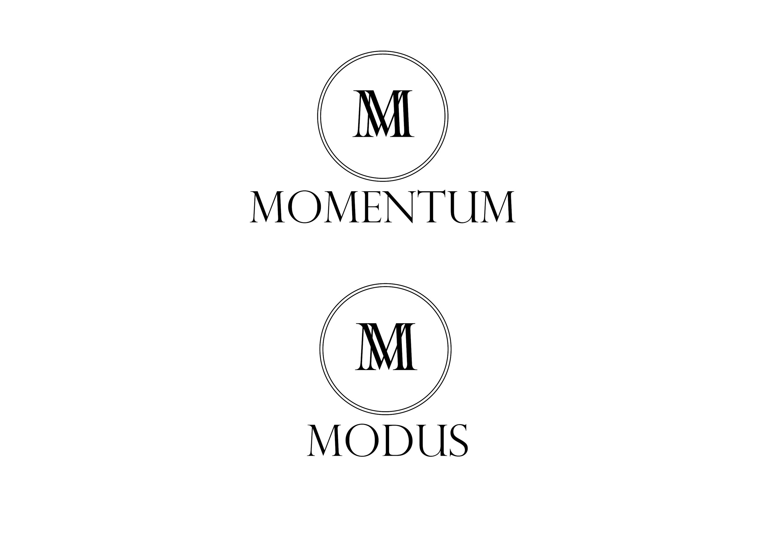
When we have been approached to help with branding or corporate identity proposals it’s important that we start by gaining an understanding of the company in question. The example we’ll use here was for a new company that was to be split into two parts, one part Private Jet bookings and one part travel agency. In this case the client had already settled on the names for the two arms but these were to carry a similar theme through their branding. These were to be names Momentum & Modus, the theme of the letter M already creating a link between the two. We discussed the kind of messaging they wanted to convey and we went away to do out own research and thinking.
Research & Inspiration
The initial presentation pages introduce some of the reference images and themes that we started to associate with the travel and jet based company. We began to explore the themes of aerodynamics in nature and industrial design. These images captured the elegant curves that are the beautiful result of natural and engineered friction free travel; a theme we felt struck a chord with what our clients were trying to provide as a service. As the company was to be headed by two female entrepreneurs we also wanted to avoid the branding becoming overtly masculine. We identified this as something which could result from deriving too much inspiration from the automotive industry and would need to be tempered as we developed the ideas.
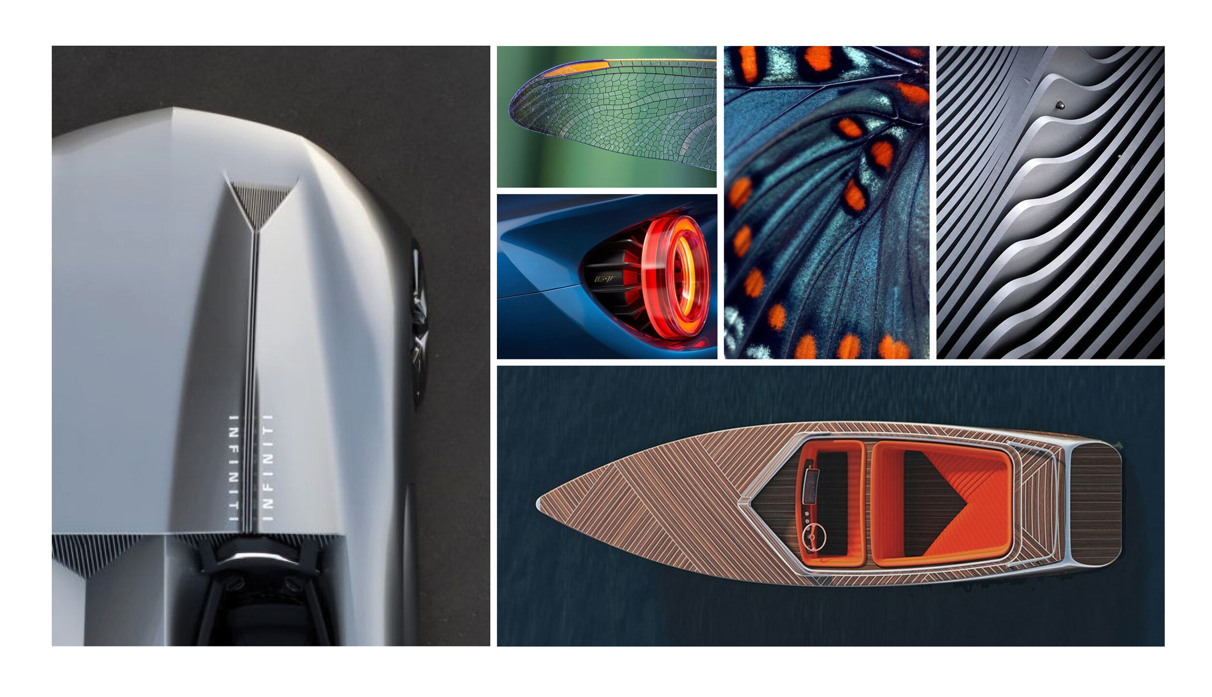
Form + font + colour
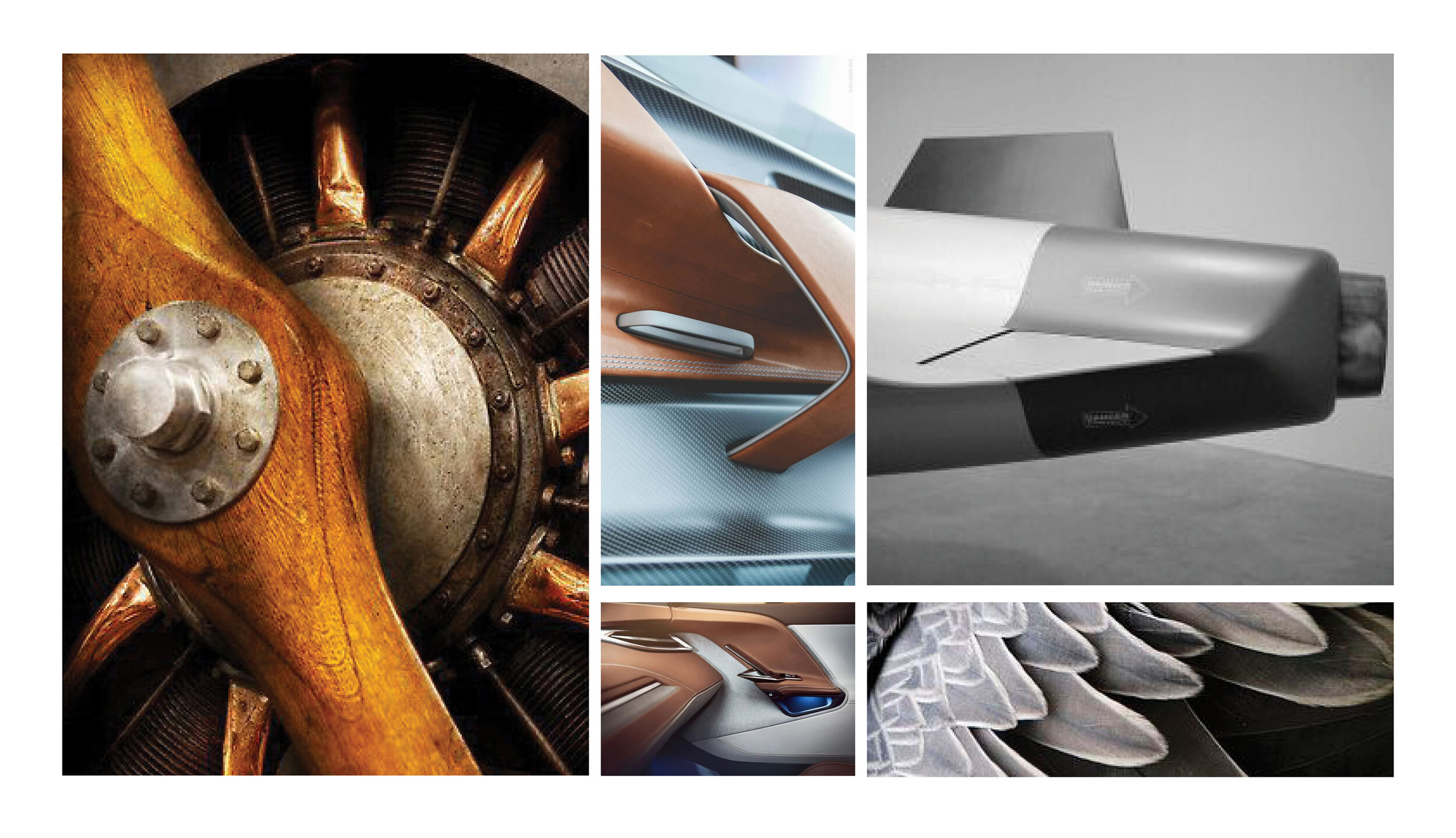
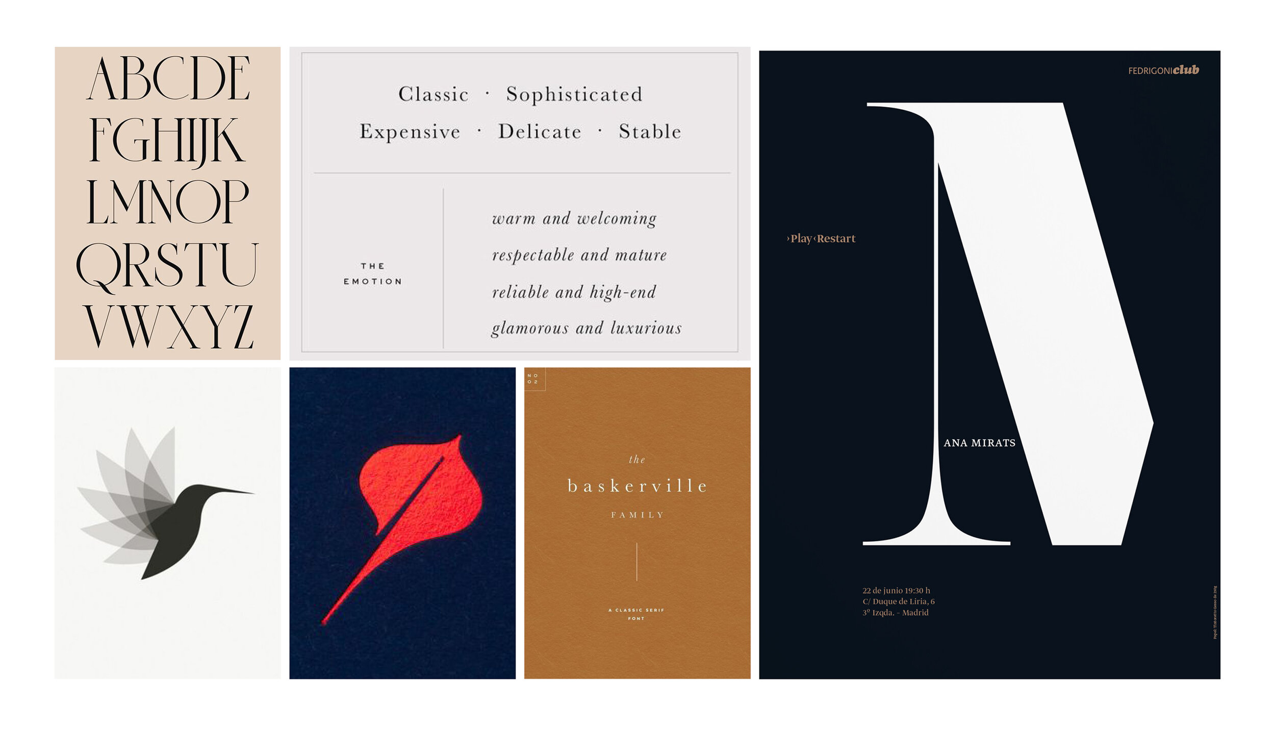
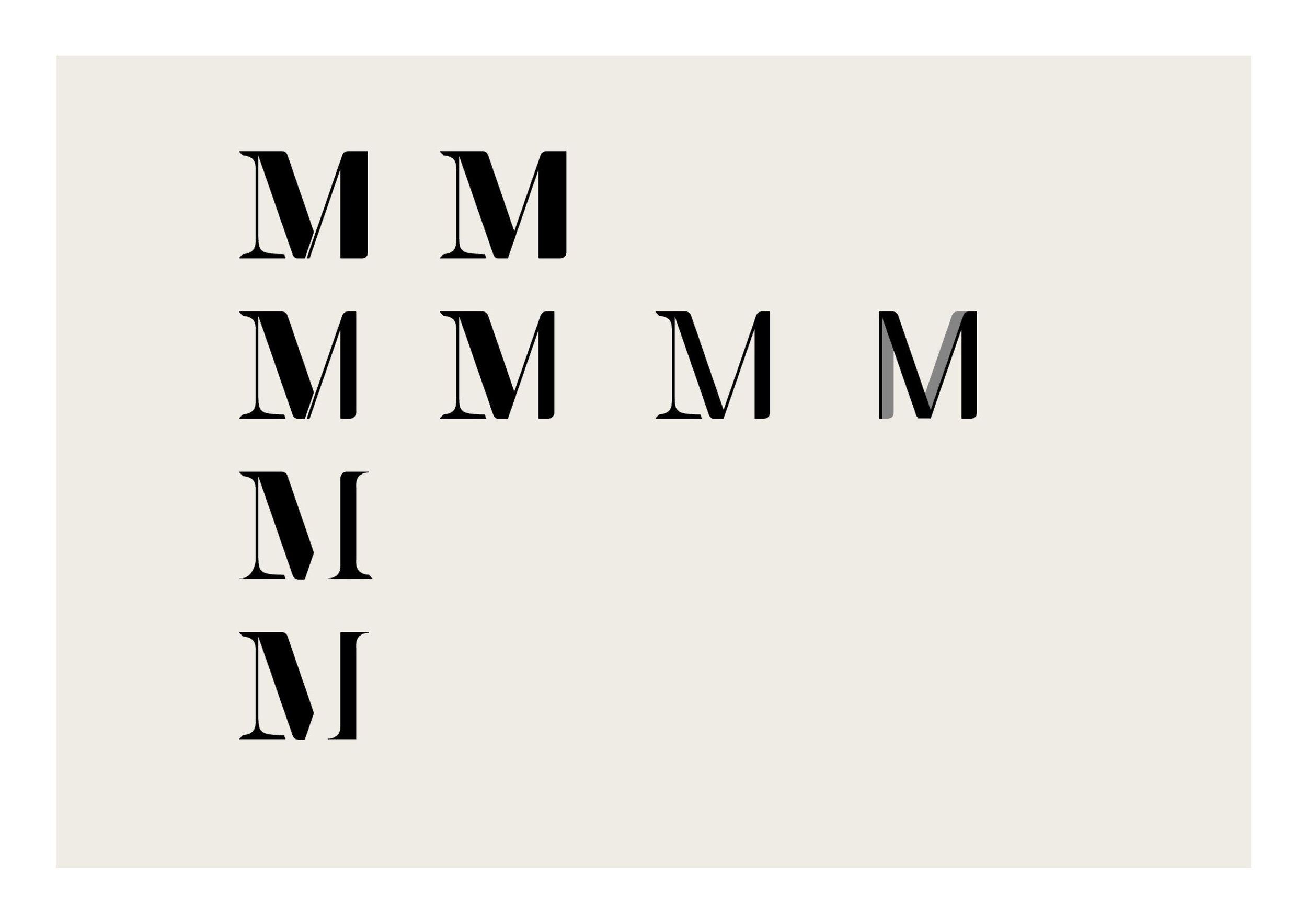
We find when developing branding proposals that there are a few key tools at a designers disposal that, like ingredients in a recipe, give us the chance to infuse particular traits to the brand. Shapes, form and their associations form one part of this recipe. This is well represented in the first panels that begin to distil the key elements of aeronautical design into the base elements. These are simple gestures in form that are instantly recognisable, in this case the particularly pleasing curves associated with aerodynamics. This theme establishes a connection to graceful movement which strikes one of the notes in the message the brand want to deliver. Most corporate identities are represented through a logo and a written representation of the chosen name, sometimes one and the same thing and in which case the font has a lot more lifting to do. Font psychology is a well established phenomenon and provides us with another ingredient to work with when trying to deliver a clear message with a brand. In this case we believed that a Serif font family would inject the correct message of sophistication and tradition that one might expect when dealing with private jets and luxury travel. This then wants to be blended with the previously established themes of aerodynamics in a style that doesn’t allow to the messaging to tip too far into the traditional or “old-fashioned”. The company still needs to be seen as modern and exciting. This selection of images begins to explore not just the fonts but also how this might combine to feel modern, stylish, graceful and sophisticated.
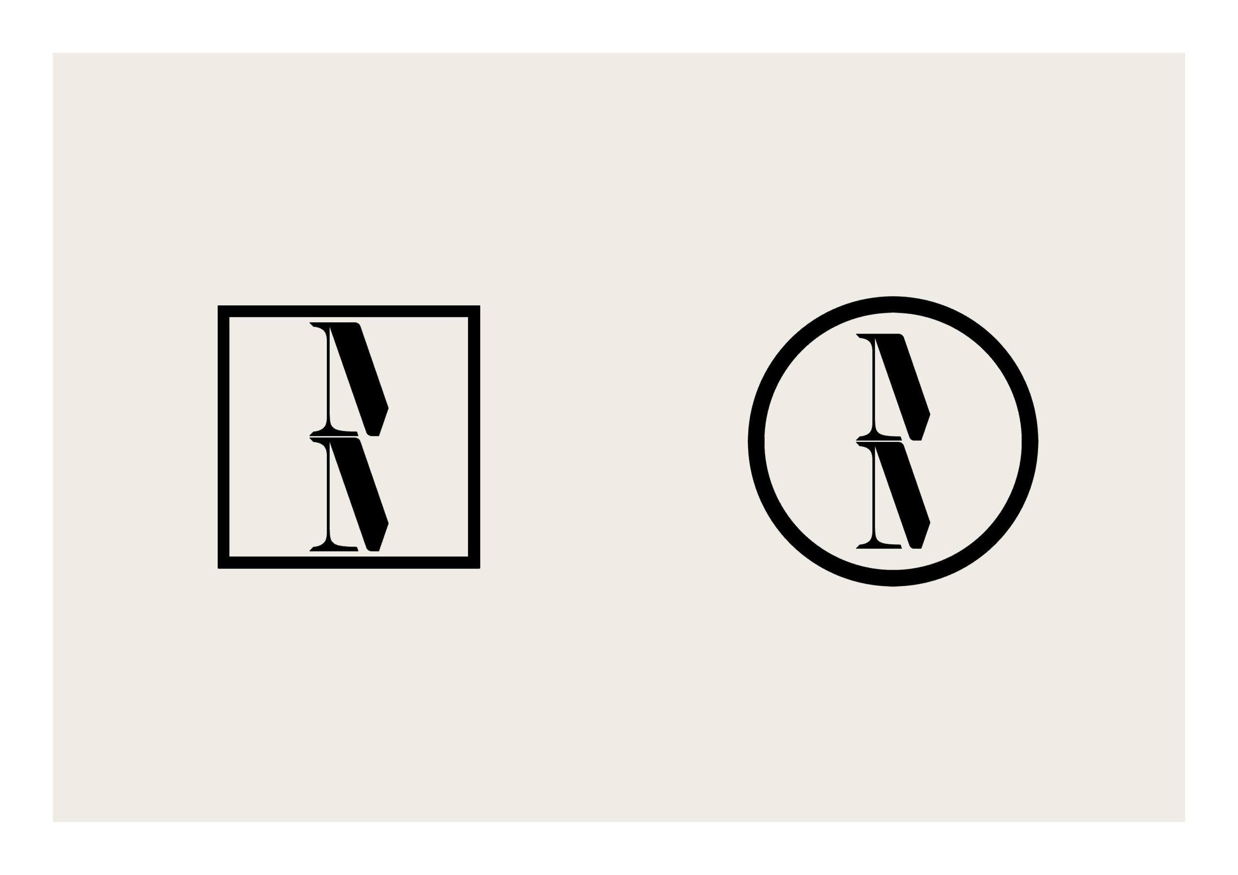
Sketch design
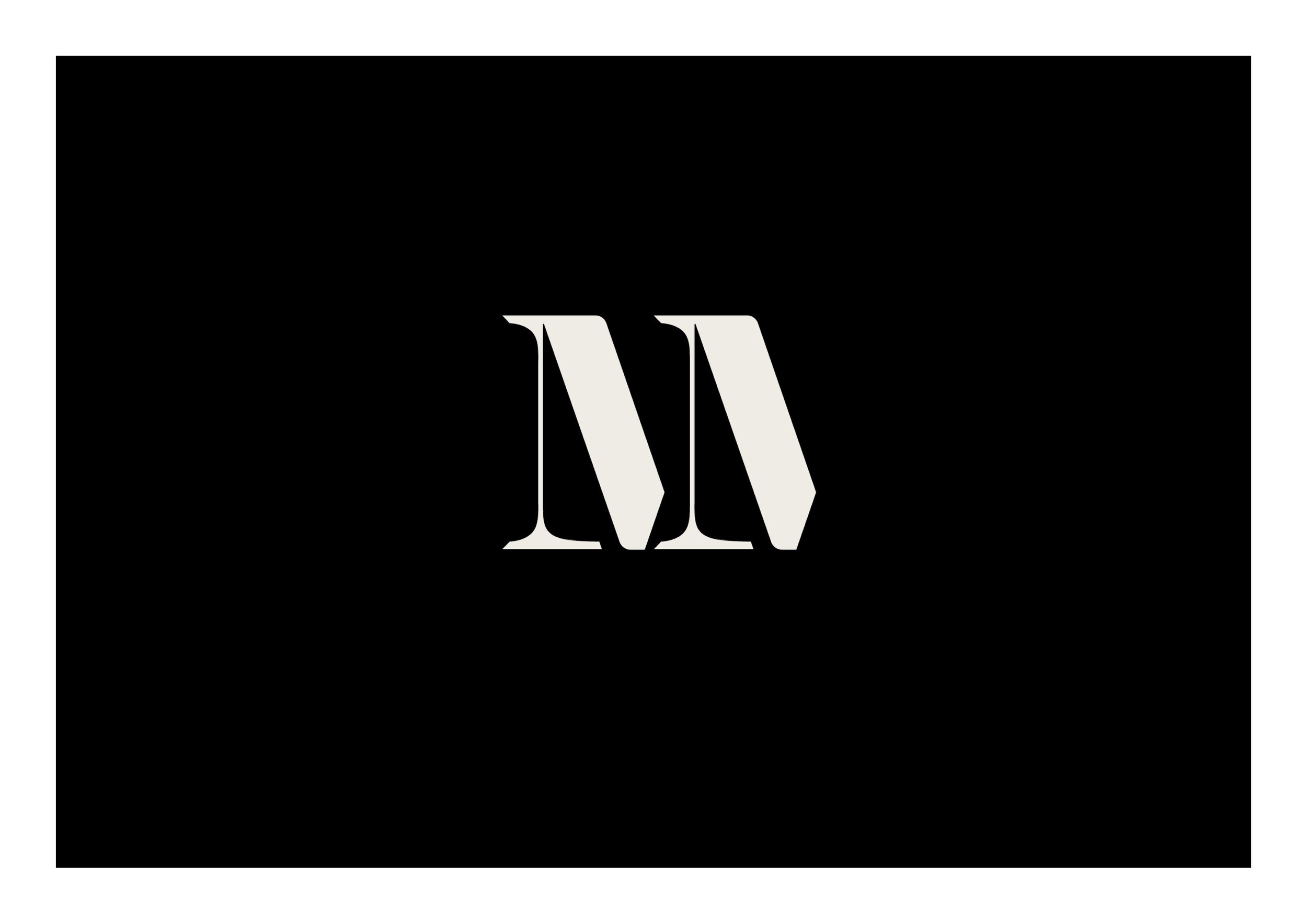
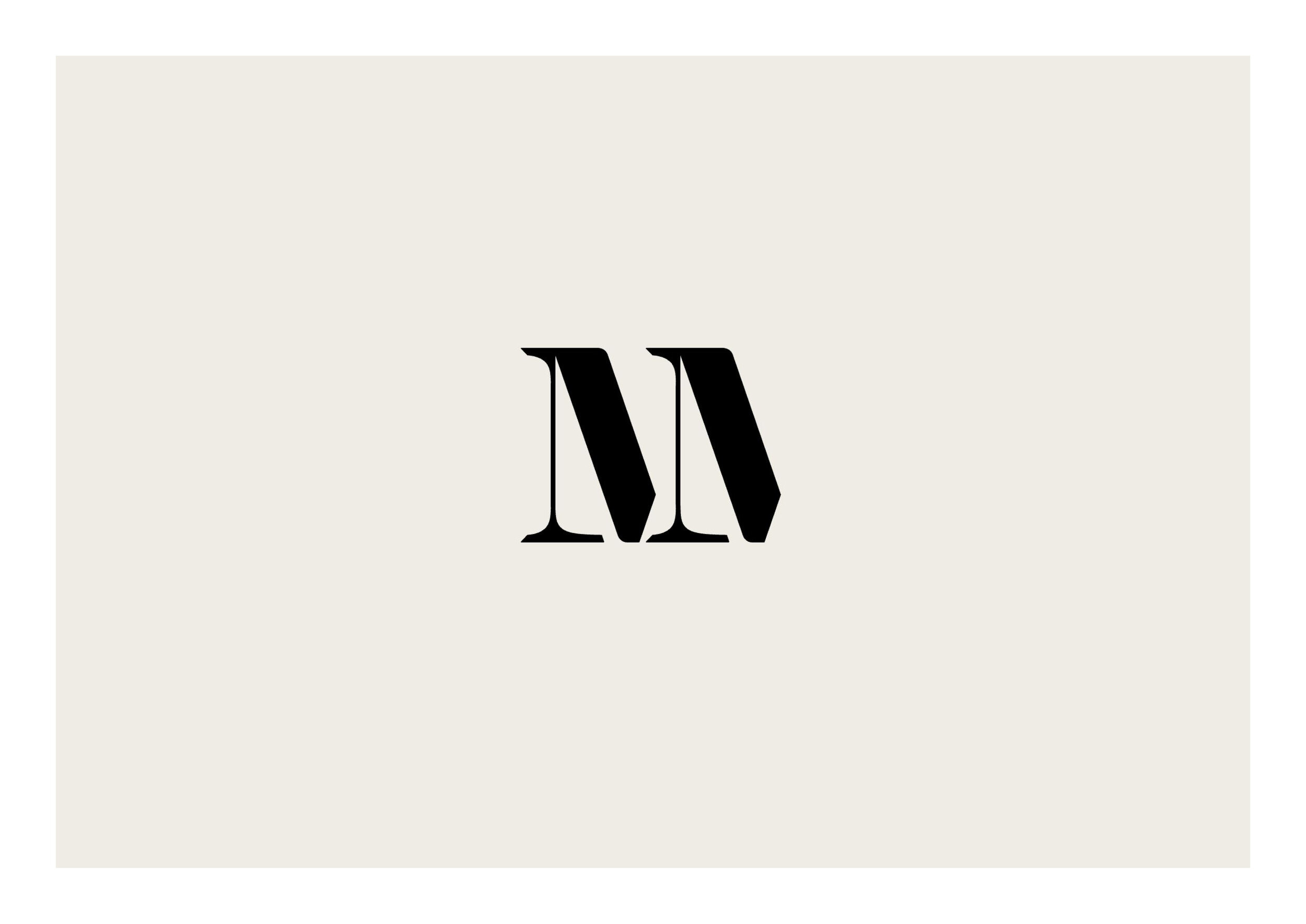
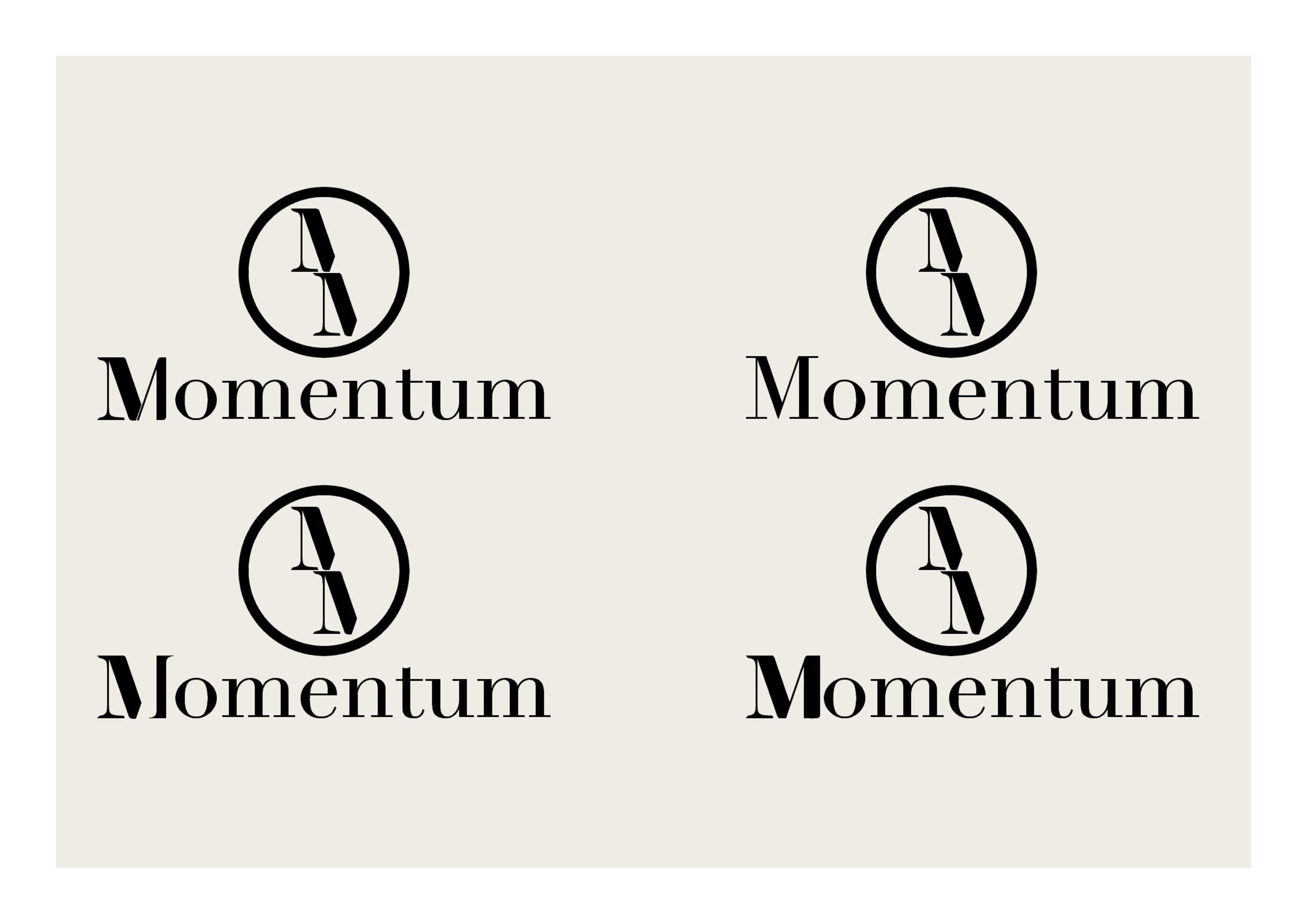
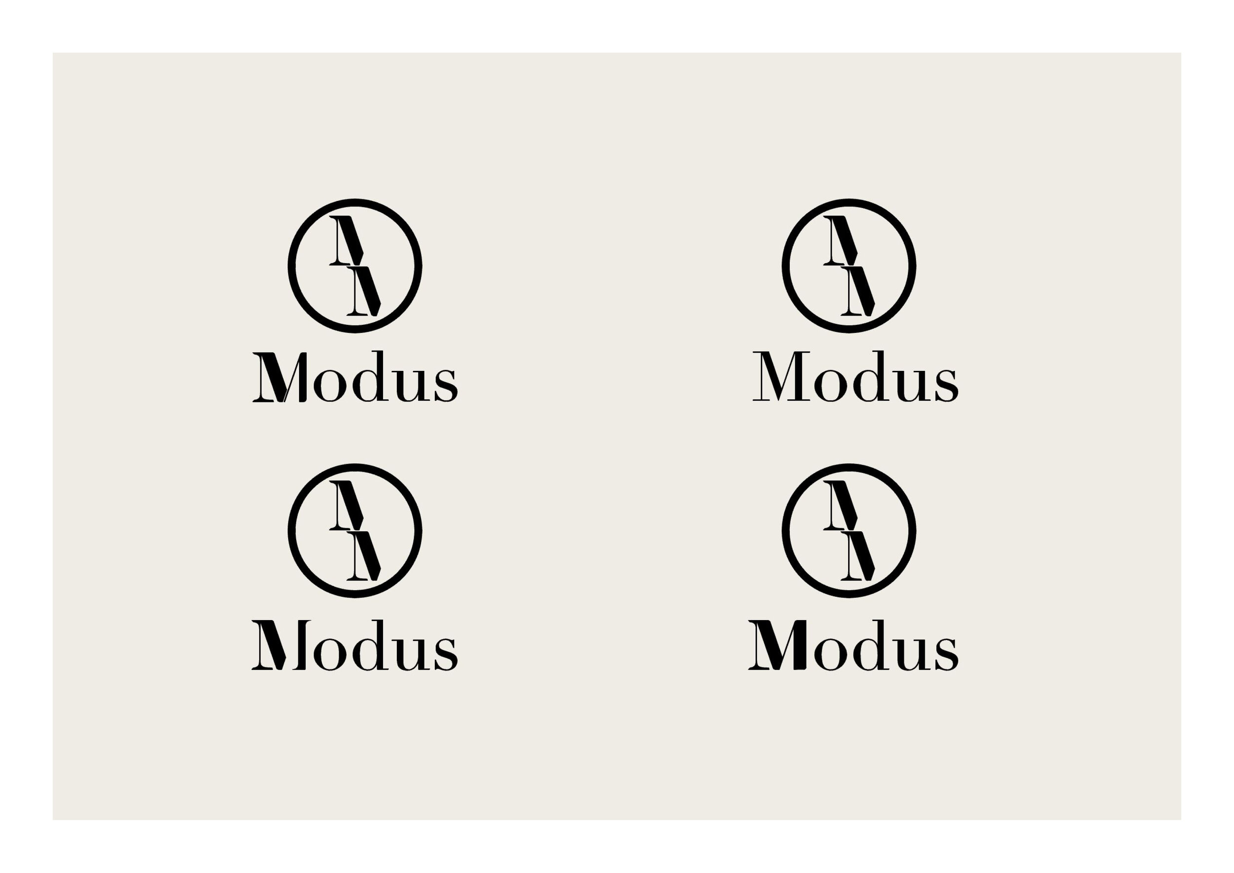
At this stage we wanted to start building on some of these themes and testing our how they might manifest into a logo. We started with a contemporary but Serif font and started incorporating some of the aerodynamic elements to the form and weight of the character M which we knew was something we wanted to play with from the names Momentum and Modus. Below shows the progression of these changes and how these might be doubled to represent the double M or the twin branding.

We explored a number of sketch options as to how this might be presented and incorporated with the brand names which was all included in the initial client presentation.
Design Development
After some feedback from the client we decided to focus on their preferred logo and style which was one of the sketches we haven’t developed in as much detail. The themes we were exploring were accepted so we continued to develop these with the specific representation in mind. We also wanted to begin our exploration of colour as another opportunity to associate the brand with the correct themes.

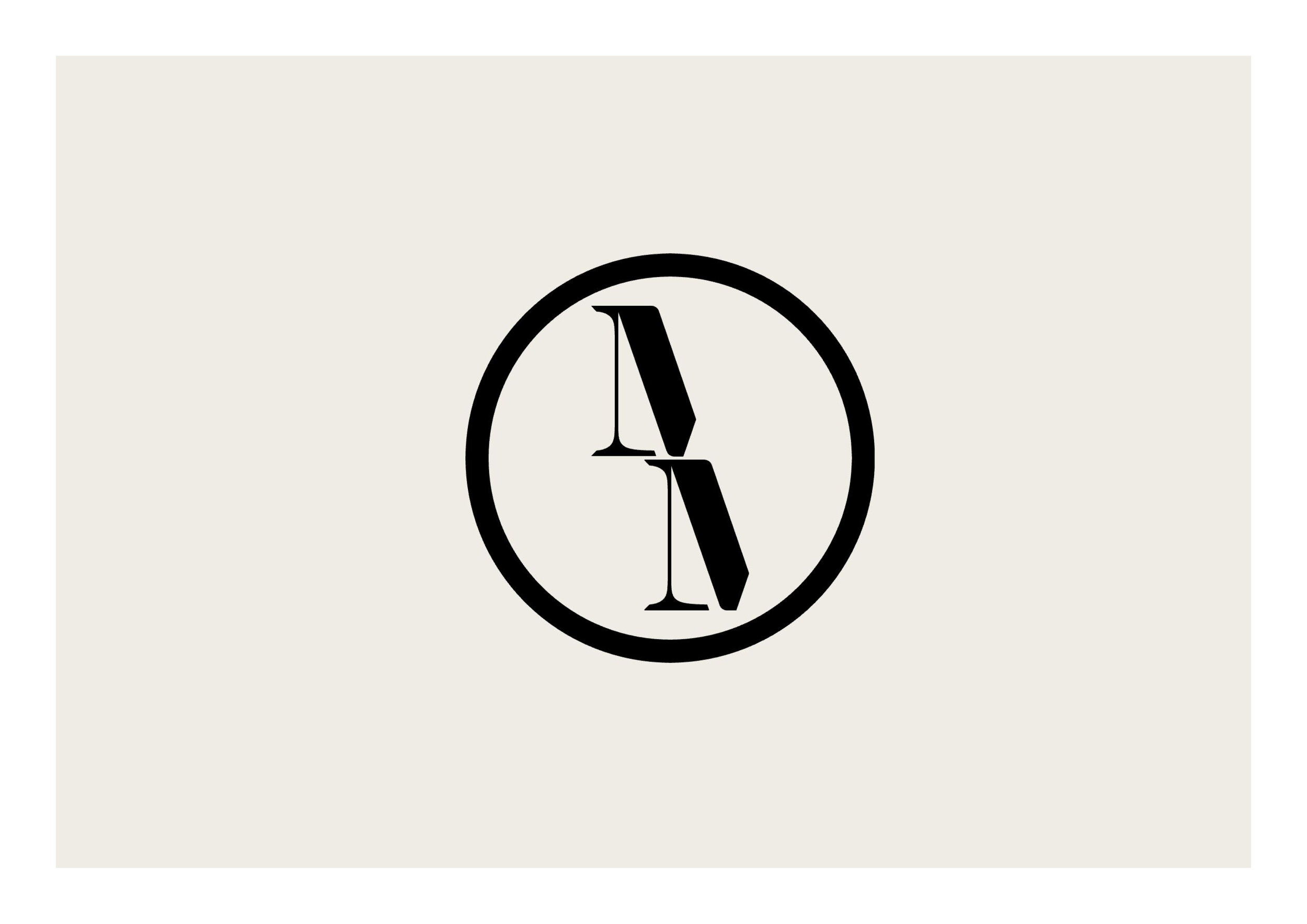
We applied the same concept to this arrangement and began some early tests with colour along with some other graphics like the circle and the wings that might associate better with the brand.


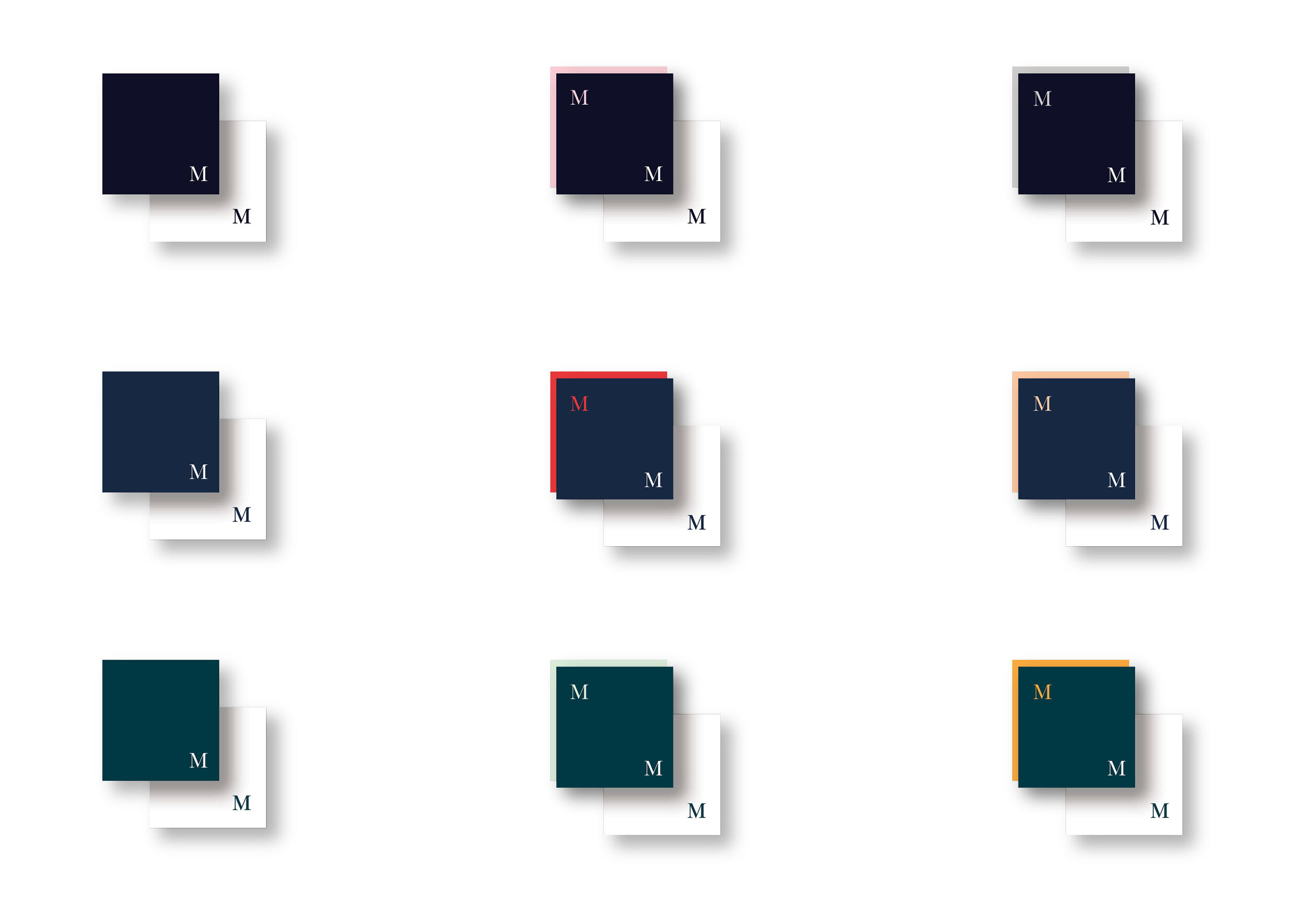
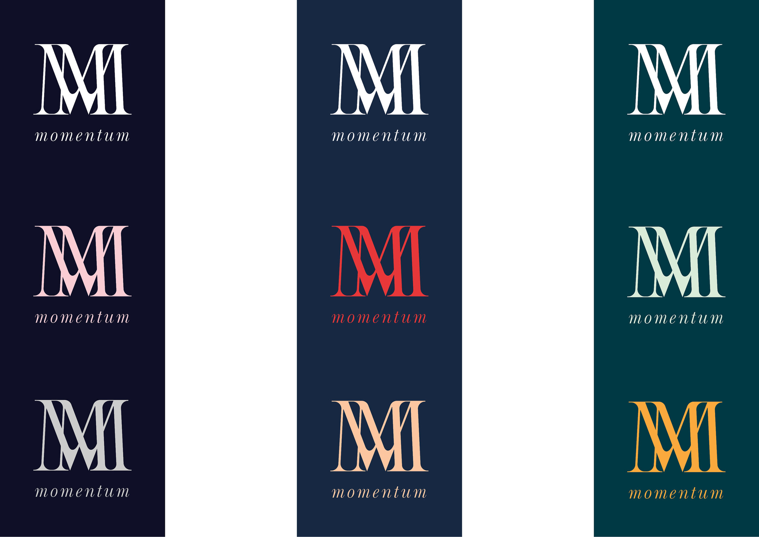
Colour
We began exploring in more depth the potential combinations that would benefit the established themes. The client had expressed an initial interest in navy blue which we also felt lent the brand the authority and trust that is associated with the deep colour. We wanted to present this alongside alternatives for comparison so explored a two primary deep blues and a deep green. We also proposed that the brand limit the colour palette to a primary, secondary and neutral trio of colour initially as this helps to be specific about the intentions of colour and appears controlled, another emotion we wanted to associate with.
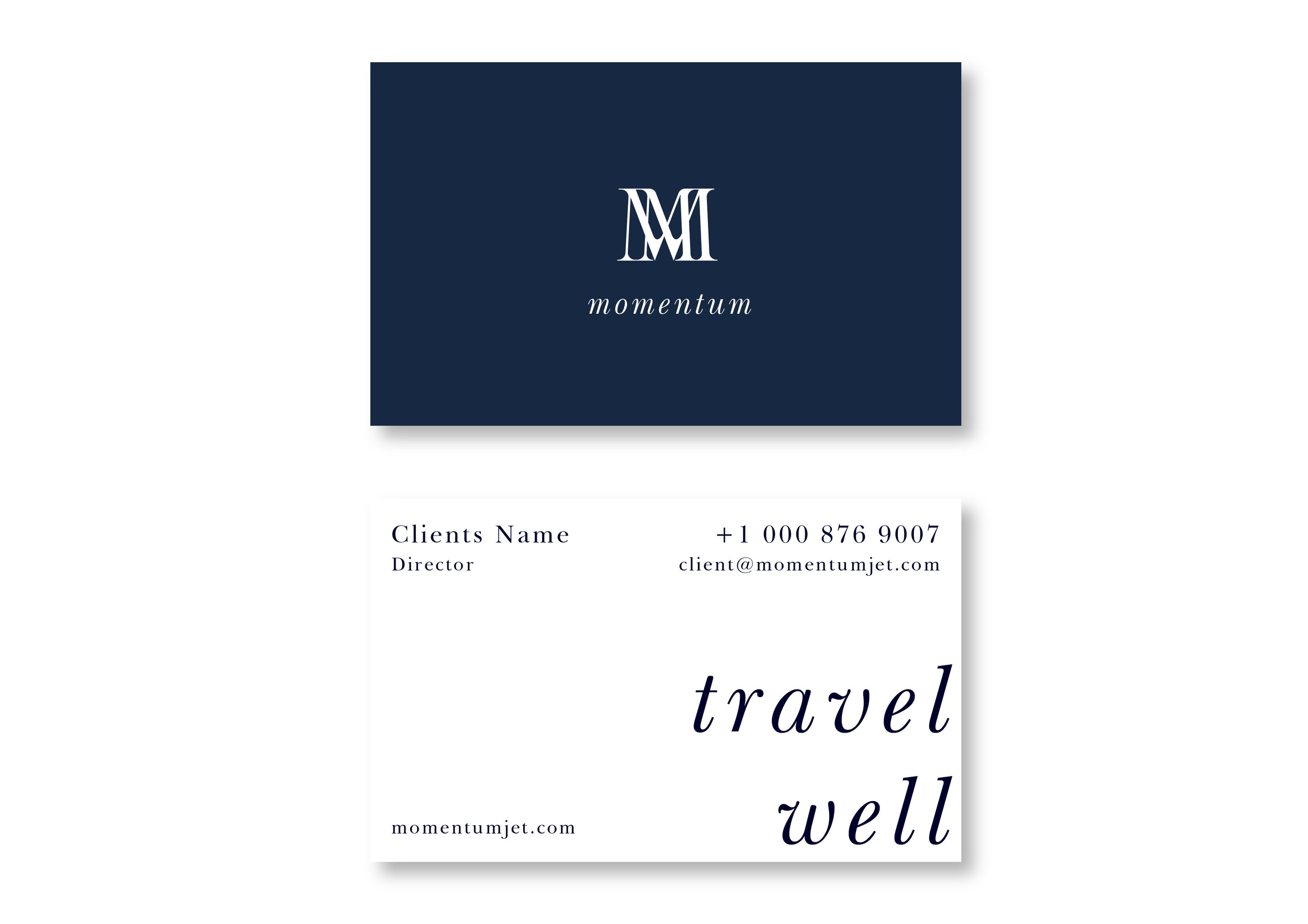
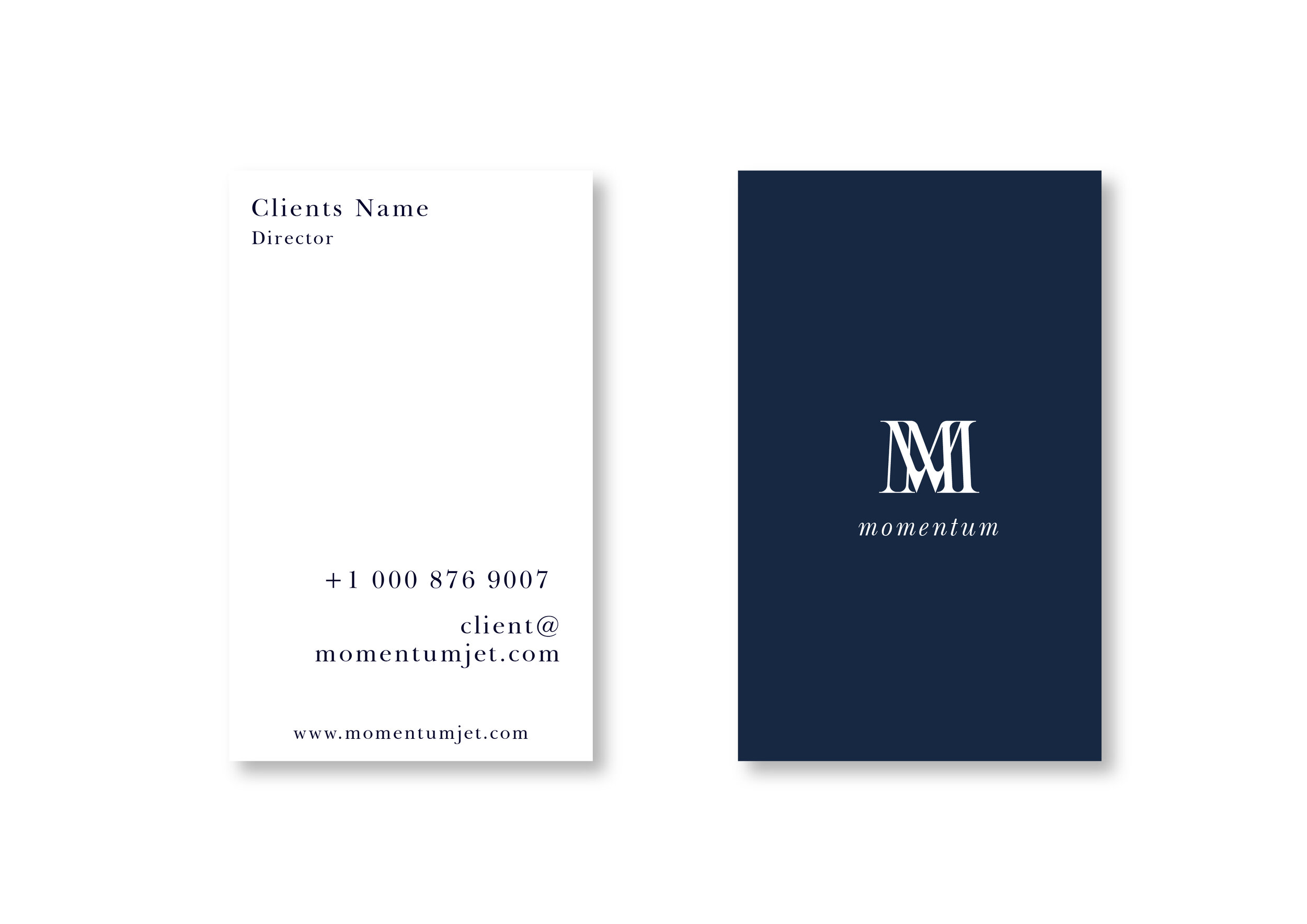
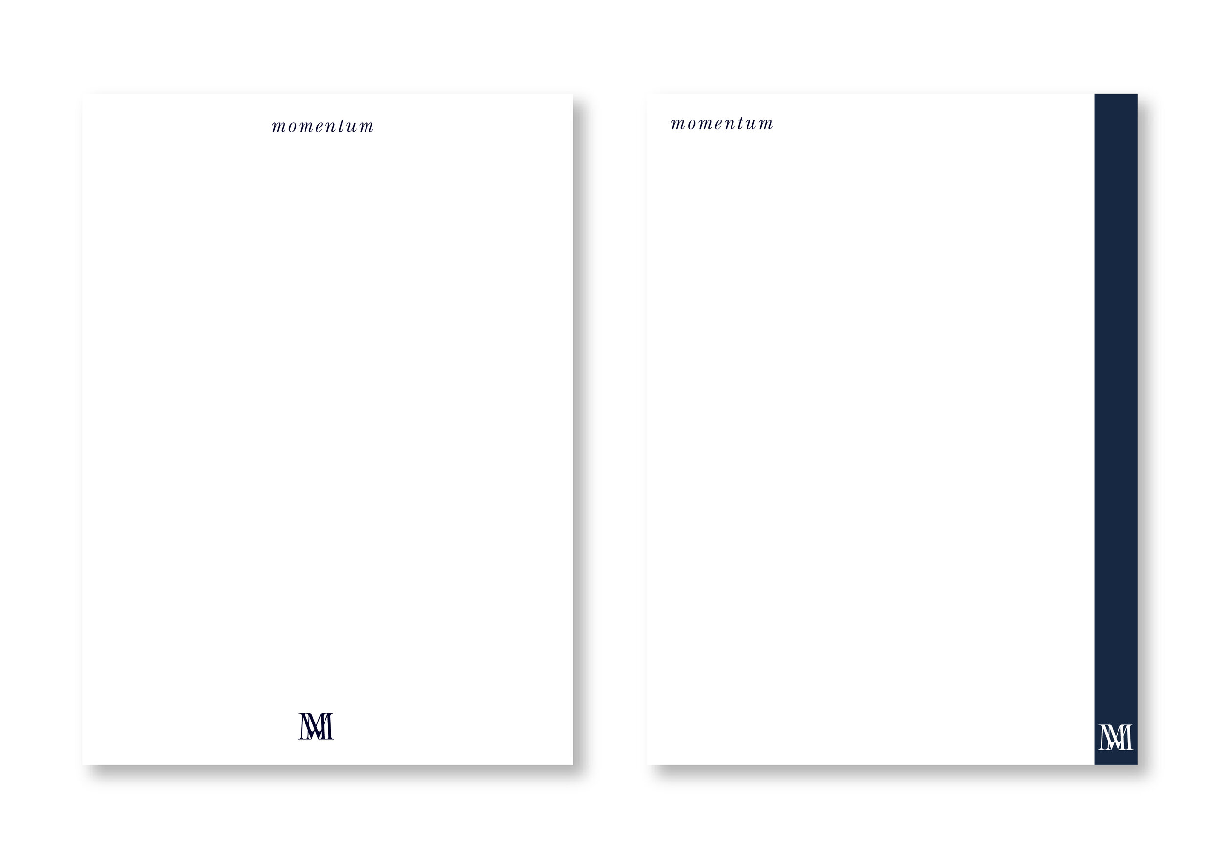
Stationary
We like to help clients get excited, particularly when starting a new venture by providing some early previews of the branding on business cards and stationary. This always helps make things feel more real and also places the branding concept in a familiar context.
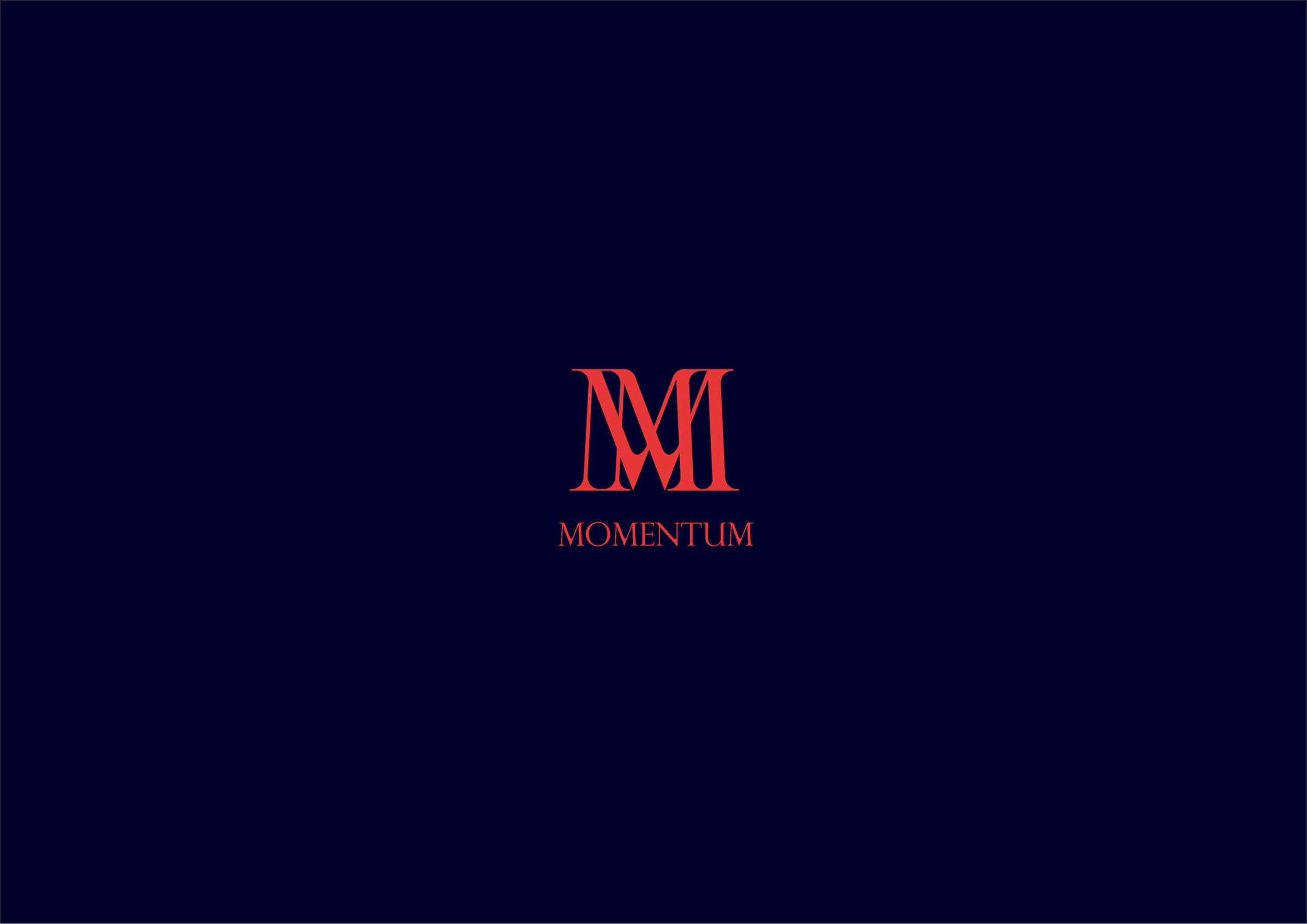
Landing Page
This project is still ongoing but the client came back with the feedback that the navy and coral colour with the logo in the rings was the preferred option and the rest of the details will be worked out in the near future. For now this is where the branding has landed.
